CES Booth Trends: How Immersive Design Turns an Exhibit Into a Destination
CES rewarded booths that felt designed like experiences, not like presentation surfaces.
Observed pattern
Architecture + content
Design brief
Build for motion, then for messaging
Field notes from CES
Three signals that separate a static booth from a real destination
This page is built like the show floor itself: one layer for spectacle, one layer for interaction, and one layer for recovery. The point is not to copy CES aesthetics literally. It is to borrow the underlying discipline that made the strongest booths feel inevitable.
Structural media
Digital surfaces now frame products and control sightlines.
Active participation
Attendees remember experiences they can influence.
Managed intensity
Calm zones keep the booth from becoming its own noise problem.
Interactive signal deck
Tap a signal to switch the lens. The deck auto-rotates until you interact.
Lead photo by Tahir via Pexels
Why it matters
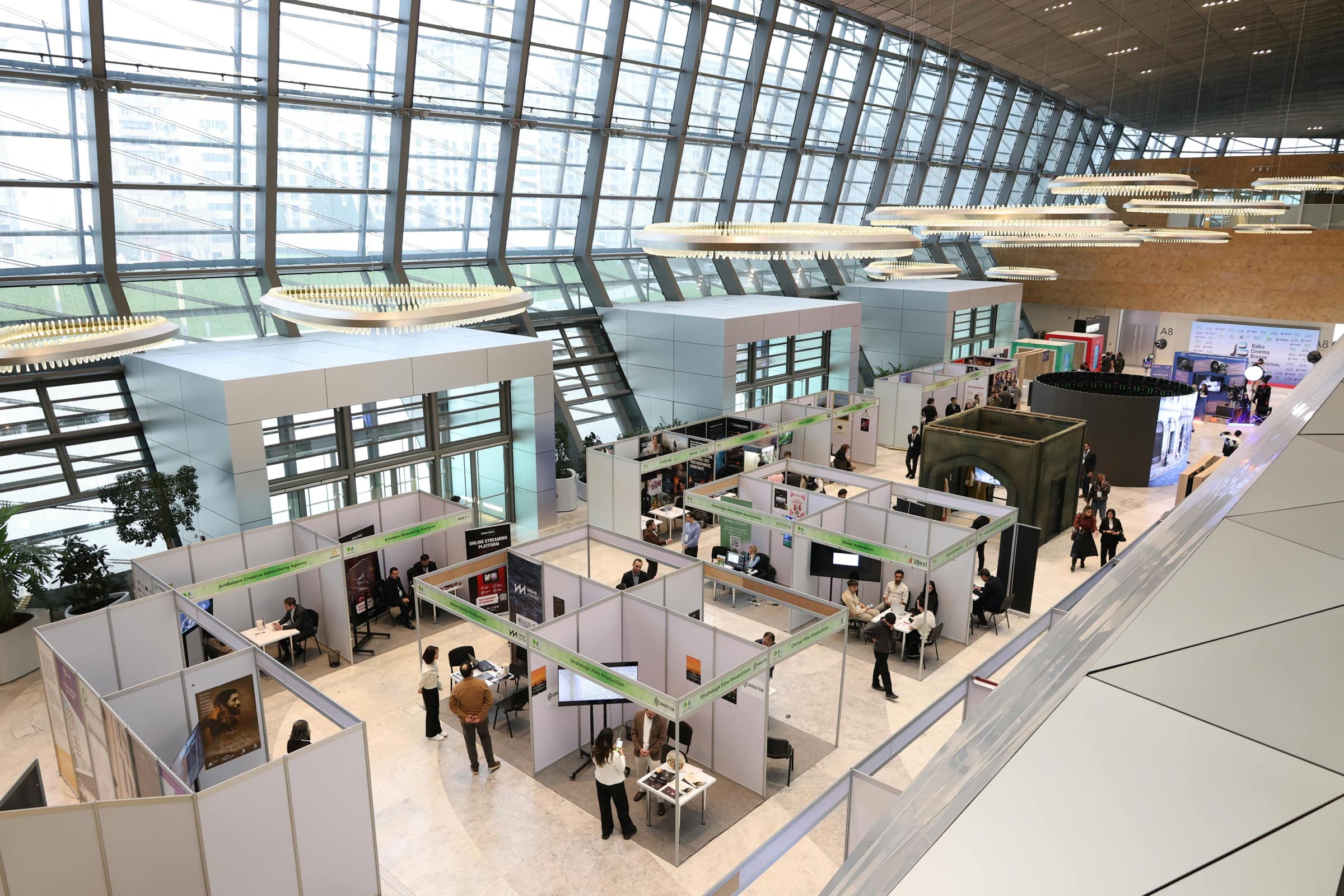
Screens became part of the booth skeleton
The most compelling CES environments treated LED like architecture: walls, portals, product frames, and field-of-view control, not just one oversized playlist.
Photo by Bertelli Fotografia via Pexels
Why it matters
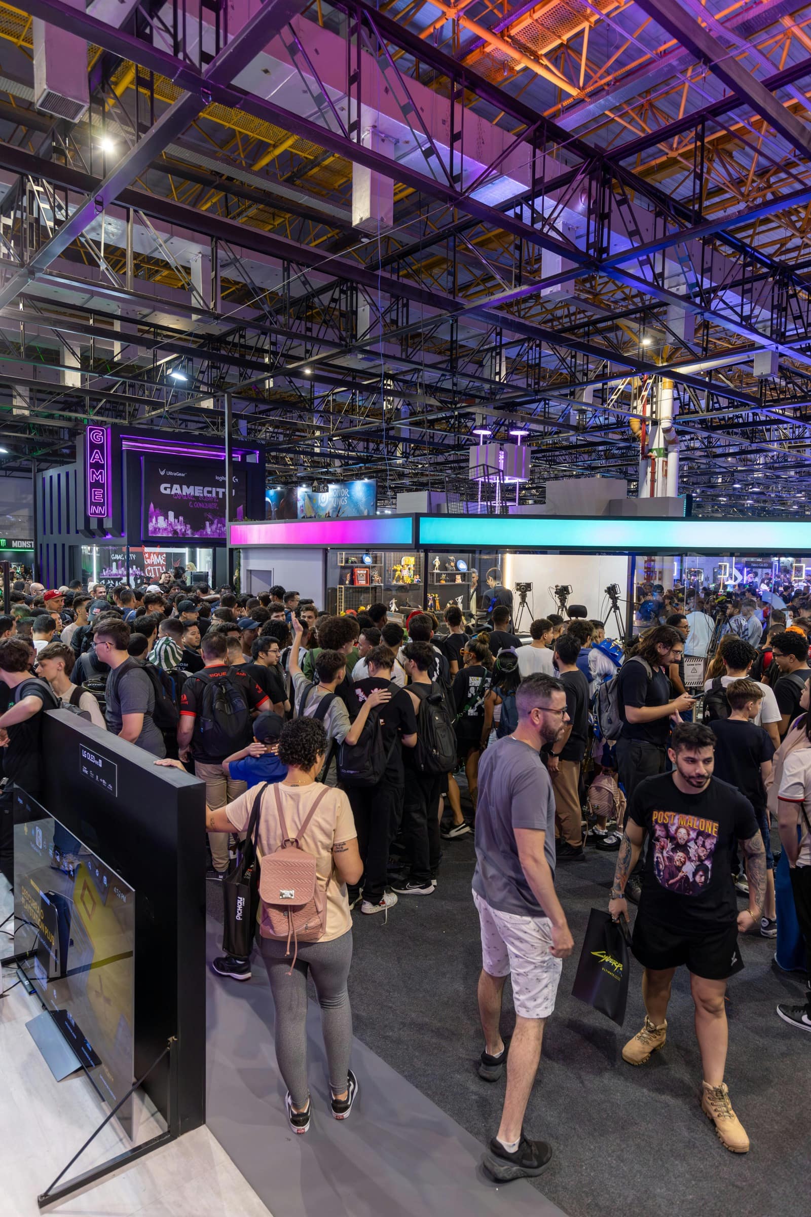
Engagement started outperforming explanation
Crowded aisles made passive presentations feel disposable. The booths that held attention gave people a test drive, a simulation, or a responsive moment they could influence themselves.
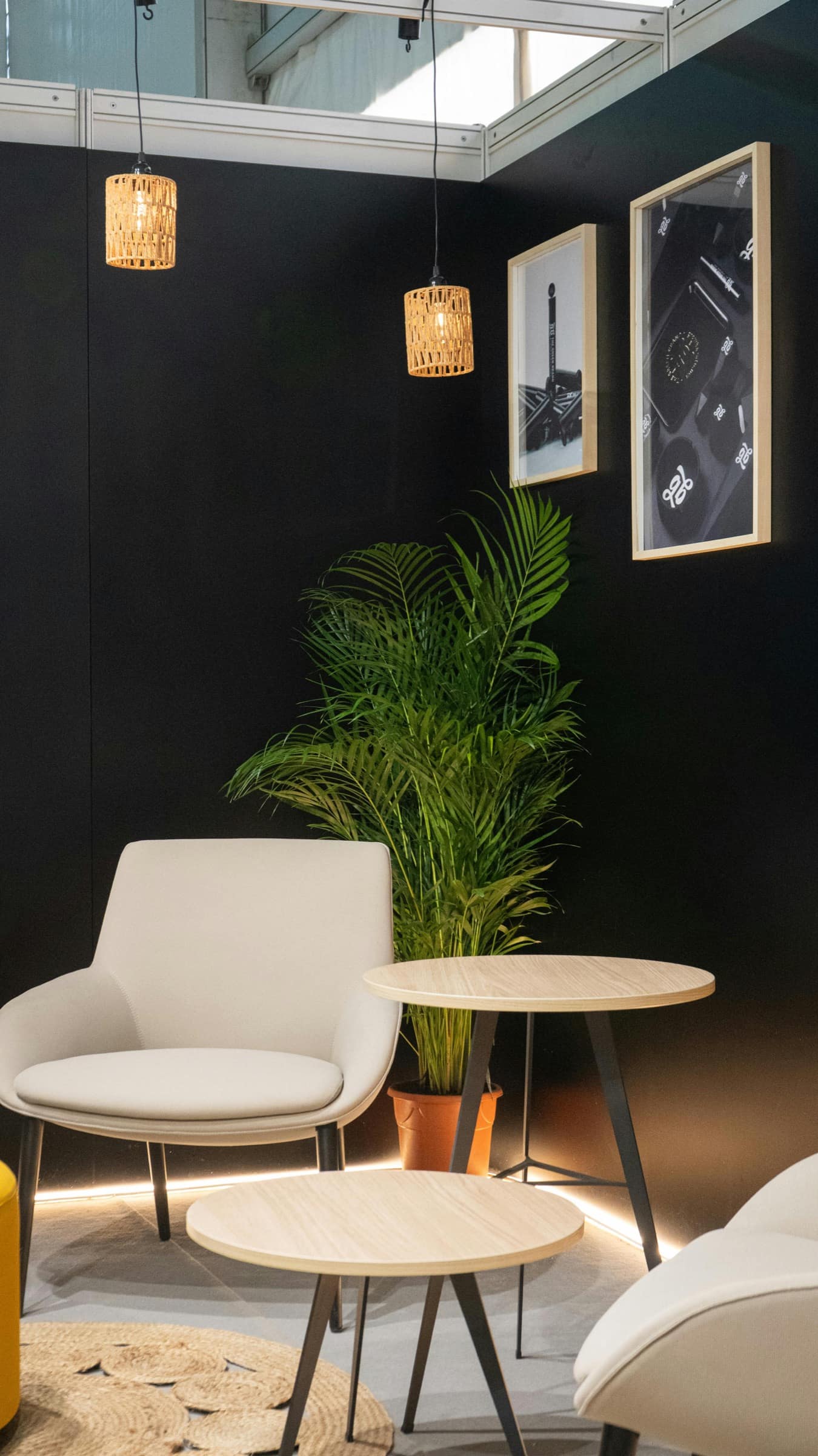
Photo by GB The Green Brand via Pexels
Why it matters
Calm became a design asset instead of dead space
The strongest brands did not stay loud for the entire footprint. They created hospitality-grade pockets where people could reset, absorb a story, and move into a better conversation.
Experience choreography
The best CES booths felt staged, not crowded.
Strong exhibit design now behaves like choreography. Every layer is responsible for a different job: getting noticed, turning curiosity into action, and lowering the friction required for a useful conversation.
Crowd condition
If the aisle is saturated, clarity matters more than more messaging.
Design response
Separate spectacle, interaction, and hospitality instead of asking one zone to do everything.
Be visible from the aisle without over-explaining
At CES, the best first read happened in seconds. Large shapes, disciplined lighting, and bold movement told the story before anyone reached the booth line.
Give attendees something to influence
The handoff from passive viewing to active participation is where memory starts. Visitors stayed longer when the booth responded to their choices instead of asking them to watch a loop.
Create a path into a real conversation
High-performing booths did not end at the demo. They eased visitors toward product context, team interaction, and a more intimate environment for follow-up.
Not every high-performing booth tries to be louder than the aisle. Hospitality-style seating, soft materials, and warm lighting can slow people down long enough for better conversations to happen.
Photo by GB The Green Brand via Pexels
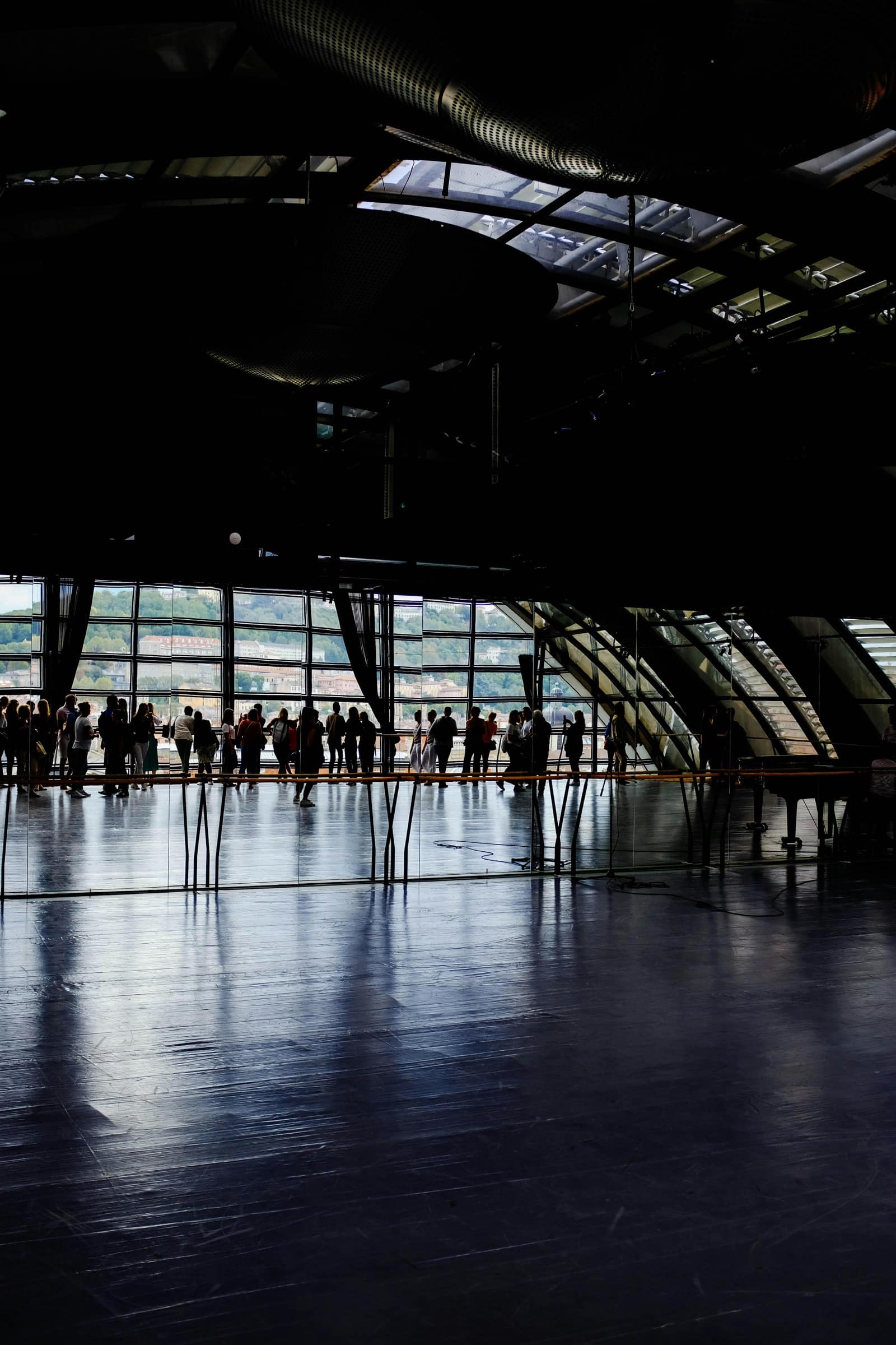
The best show-floor experiences include room to reset. Transitional spaces, quieter lighting, and breathing room help attendees recover from overstimulation and re-engage with the next conversation.
Photo by Adrien Olichon via Pexels
Balance energy with relief
A quieter corner can do more for conversion than another wall of motion.
CES made one thing obvious: overstimulation is real. The exhibitors who handled it best built softer environments inside the footprint itself. Warm light, lower-volume content loops, and hospitality-grade furniture gave attendees a chance to stay present long enough for a stronger conversation.
Control sound like a design material
Directional audio works. Ambient noise layering does not. Let sound reinforce one moment instead of leaking across the entire footprint.
Program the booth in modes
A space can feel calm between demos and more theatrical during a presentation. Plan both states instead of locking the booth into one energy level all day.
Exhibitor takeaway
Borrow the logic, not the budget line.
You do not need CES money to learn from CES decisions. What matters is clarity: one striking visual read, one memorable participation point, and one calmer place where the conversation can actually close.
Audit every passive surface
Look for walls, towers, and pedestals that currently deliver information but do not shape behavior. Those are your best opportunities for layered media, light, or motion.
Choose one unforgettable interaction
Do not make every square foot interactive. Pick the one experience that proves the product value fastest and build the choreography around it.
Design intensity in waves
A memorable booth has contrast. Spectacle gets attention, but relief creates dwell time. Plan both with equal seriousness.